Thomas O'Brien
"Design can be many things to many people, but to me, it has always been about tradition in modern life. I am guided by traditions, both inherited and studied, which I will bend to the moment I am living in. I'm one to look back in order to move forward." - Thomas O'Brien
Ok, I admit it. I have an obsession. I just can't get enough of Thomas O'Brien. Ever since I got his design book AMERICAN MODERN for Christmas a couple years ago, he is the designer I constantly come back to for inspiration. I am finishing up a job for a client who wanted a midcentury modern, eclectic style. He collects art and loves modern, iconic designs. Who do you think I was channelling through that design process? You guessed it.
O'Brien appeals to me as a designer mostly because of how he explains his process. I may be the only nerd who actually READS design books, but it may be because of his. I have actually read it cover to cover a dozen times. He is a fabulous writer. He is able to eloquently and adequately portray his design process. One commentator said this, "A personality and presence does come through in Tom’s home – as if he has an actual hand in decorating it." I think that is what I sense in his interiors, and not just his own homes that have been featured countless times over the years. Even his client projects - I love how he seems to know them and is able to honor their style while also subtly injecting his signature "american modern" touches. AMERICAN MODERN is inspiring for the vignettes and collections, explanations of the history of pieces, and his work's clean, architectural lines. I can't recommend it enough.
The image on the cover of his book, featuring the renovated version of his New York apartment.
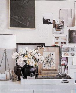
An artful vignette, including one of the coveted Aero trays from his design studio.
A view into the living room of O'Brien's Long Island home, The Academy.
O'Brien describes in the Urban Modern chapter of his book, "This is the palest modern palette I love - white, grey, cream, and the palest blue. A special edition of Russel Wright silver-plated flatware rests on my concentric ring stoneware dishes for Target. The textile is bleached indigo from Africa."
Tilden Flush Light Mount for Visual Comfort from O'Brien's line - yes please!
Not to mention I love any designer who makes products for Target. :)
I will end with one of my favorite quotations from the Introduction of AMERICAN MODERN.
"Make an object work well and look correct in proportion and line. Highlight good structure and authentic details. Eliminate excess but prize gracefulness. Be sustainable and sparing in the use of materials. Create for the enjoyment of all - not just some." - Thomas O'Brien


