The Brocasa
Yay - it's finally here! The post where I spill all the design and source info on our kitchen remodel. Thank you for your interest and excitement surrounding our space. I hope that this information is helpful and inspiring to you!
We lived in our old kitchen for about two months before gutting it, and I am glad we did. Living and working in that kitchen made me feel confident about the changes I wanted to make, in order for the space to flow better and work smarter. And obviously I wanted to final space to be comfortable to be in and pretty to look at, knowing I would spend so much time in there every day (and I do)!
Here are some pictures of what the old kitchen looked like, and how I wanted to change it. (Those yellow fridge handles being priority one! Haha!)
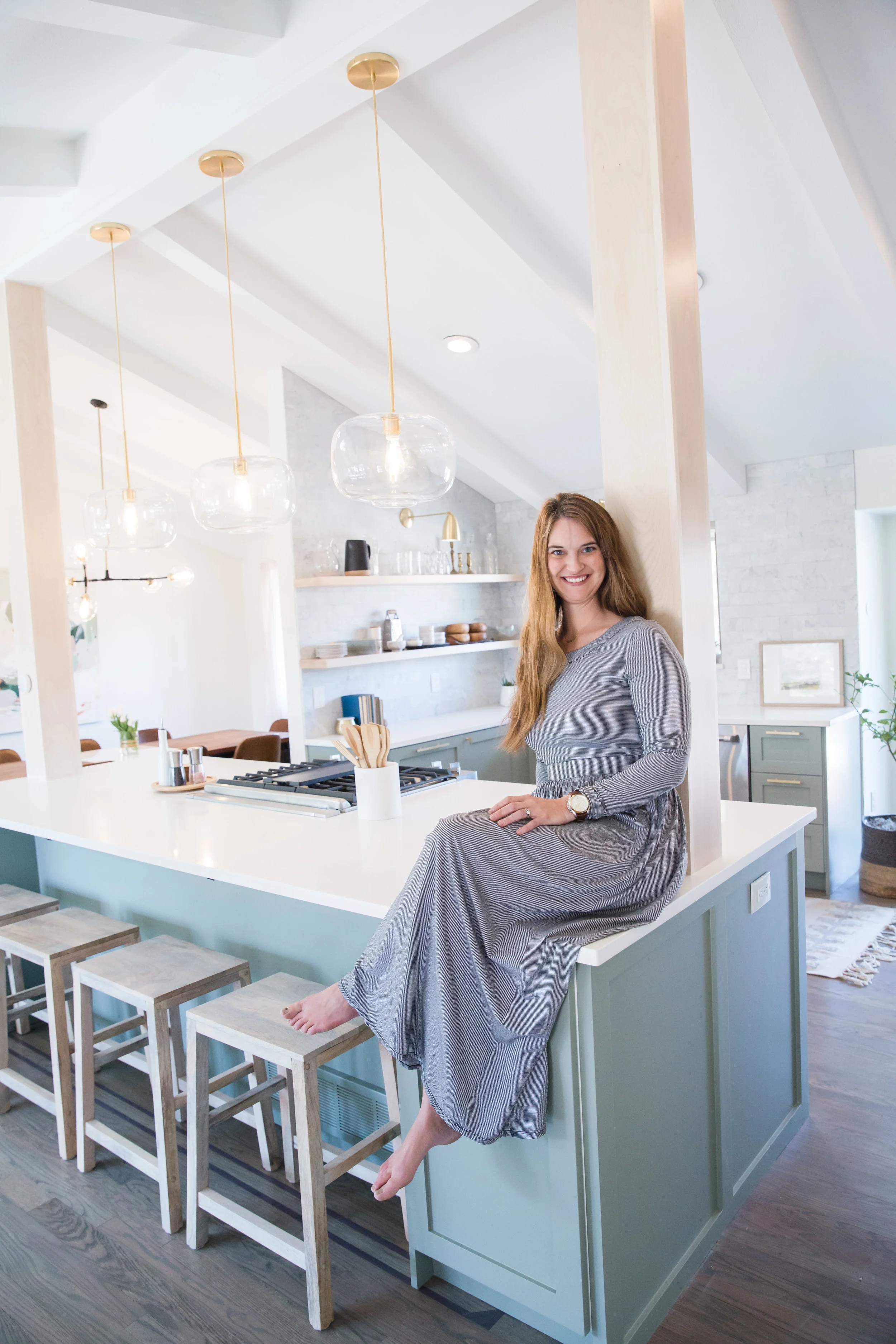
When I originally did the floor plans for this space, we planned to keep only the post nearest to the dining room and completely eliminate the other one. In that design, there would have still been a portion of that wall in place behind the range, so I would have had a large peninsula there instead of the full island we have today. After speaking with an engineer and realizing how labor-intensive and expensive it would have been to remove even one of the columns (because of the long span of our center beam), my husband convinced me that we should just keep both of the columns and open up that wall completely. I AM SO THANKFUL WE DID! It is one of my favorite parts of my kitchen! We were able to wrap the posts in maple to match our shelves, and I love how they tie into the space.
Here is the floor plan we ended up with after MUCH debate ::
The small blue boxes with the Xs inside denote the existing columns, so you can see how we pushed the footprint of the kitchen into the living room by about two feet, plus the stool depth. I knew I only wanted a small sitting room in front of the large windows, so I didn't mind the kitchen creeping into that space, especially since it is all open! Also, we have a Hearth Room just five stairs down from the kitchen, which is our family room space, as well as a large playroom in the basement, so this living space is really just for baby play dates and a spot to sit and drink my coffee and read in the mornings.
Extending the island toward the front door allowed us to expand the skinny Dining Room just enough to seat 8, meaning we could seat 12 between the table and island! We love entertaining, so we wanted to be able to accommodate a crowd.
I was a bit nervous about the space between the end of the island and the stairwell feeling too tight. But it was necessary to encapsulate the columns completely within the island footprint. To open that stairwell space up, we eliminated the balusters that would have been butting up against the fridge. You will see in final photos that the stairwell going down to the Hearth Room is completely open, which I love, even if it does provide an issue installing a baby gate!
Here is that whole space now ::
Here are the kitchen elevations ::
SINK + SHELF WALLS ::
This footprint is the only thing that remained the same as the old kitchen. I played with the idea of eliminating the small wall the shelves are on (between the dining room), since it is the only wall in the space. However, we really needed the storage! Also, that shelf wall is my FAVORITE design element of our kitchen. That corner makes me so calm and happy!
COFFEE BAR + APPLIANCE WALL ::
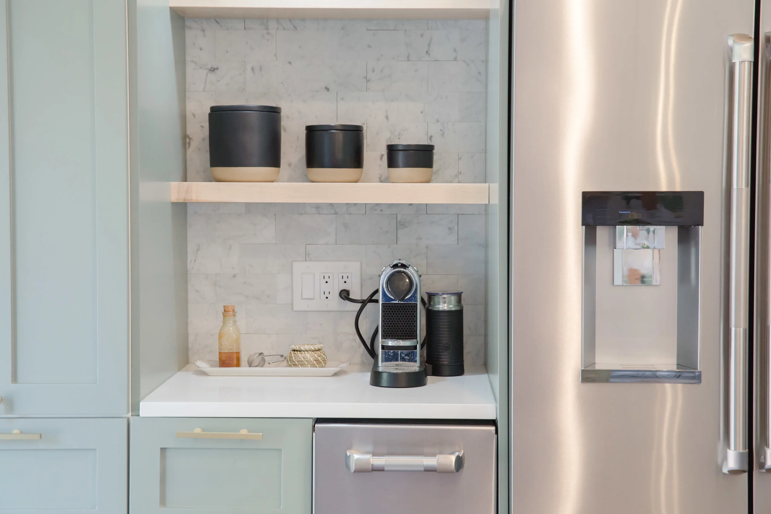
The east elevation is our workhorse wall. That wall originally had an awkward peninsula, and the bottom half was glass block and balusters. I am sure this was done to open the space up to the Hearth Room, but it seemed rather impractical and a huge waste of space, in my opinion. I am SO GLAD we decided to incorporate that wall into the kitchen (rather than making an eat-in nook, which was one option). We were able to move the refrigerator there, enabling the island to be completely open. It also houses the ice maker, and a tall cabinet with the microwave, toaster oven, and pull-out trash + recycling.
ISLAND ::
As you can see, we went with a freestanding range but didn't do a hood. We went back and forth over the idea of a hanging hood above the island, but I was pushing big time to have the space completely open. That meant using a downdraft vent. Downdrafts are not typically installed behind ranges -- most are made to go behind a cooktop, so that the vent blower can nest below that cooktop. 99% of downdraft vents would be ineffective installed behind a freestanding range because of how far from the cooking surface they would need to be installed for the whole mechanism to fit below the countertop. Because of these facts, our appliance guy and contractor were very resistant to me pushing for a downdraft vent behind the range. But I knew we could find a solution (also I'm very stubborn - ha)!! I had done it before with a client, where the blower could be flipped to the back of the vent. However, that didn't work for us either since I wanted there to be open space on the other side of the island for stools. Luckily, our appliance guy showed us THIS downdraft by Best that has a remote blower! We installed it in the back of one of our island cabinets. Even though it was a splurge, I love how efficient and quiet it is, how high it rises (to capture maximum fumes), and the LED light!
SOURCES ::
Cabinetry - IKEA boxes with DIY Shaker from Semihandmade painted Evergreen Fog by Sherwin Williams
Countertops - MSI Stone's Q Quartz in Arctic White
Appliances - Jenn Air from BAC
Backsplash - Dry stacked, honed, 3x6 carrera marble by Oracle Tile
Sink - White apron farm sink by Olde London
Faucet - Matte black by Vigo
Hardware - Brushed Brass by Lewis Dolin
Sconces - Custom from Retro Steam Works
Pendants - West Elm
Shelving - Solid hard maple from Austin Hardwoods
Counter Stools -
A HUGE thank you to our project team -- we could not have completed our renovations so successfully without you!
Contractor - HOW Construction
Painter - North Star Painting
Stone Fabricator - Pinnacle Stoneworks
Thanks so much for reading!!


