Brocato Remodel :: Kitchen Inspiration
The kitchen was the first major space to renovate, and probably the one I have been planning for the longest. I have been thinking about my dream kitchen for years, most seriously since the beginning of design school. And these days, Pinterest and Instagram make dreaming of a new kitchen a daily occurrence! Then, about two years ago, we thought we were going to stay in our old house and pop the top. So I designed a first iteration of my dream kitchen. Thankfully (in retrospect) that didn’t end up happening! Since then I feel my tastes have been further refined. I think many designers would agree that after designing for clients and being constantly inundated with interiors imagery, you begin to crave a clean, calm slate. I also feel this way as a mom. Our house has enough crazy with a toddler and almost-toddler — I don’t want our space to feel too busy or cluttered or overly colorful. Obviously this is a personal choice, but I have just found that the older I get (or maybe the crazier my household gets?), the more I crave clean, neutral, natural light, airy space.
So that is what I hope to achieve with our kitchen. Let’s begin with some inspiration images.
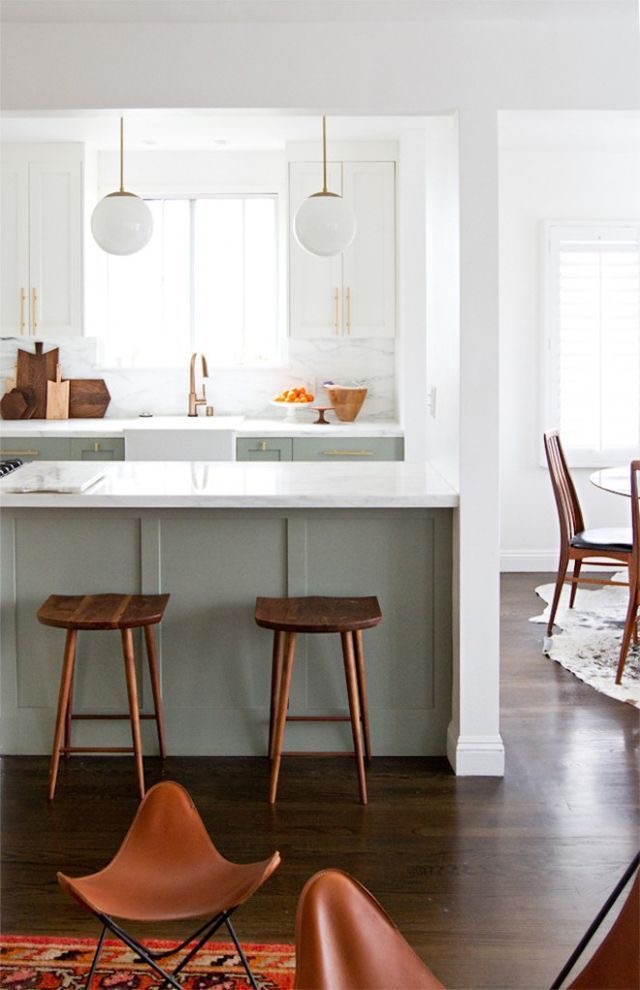
Sarah Sherman Samuels’ kitchen may be one of the most pinned kitchens on Pinterest as of late, and with good reason! I stumbled upon the SSS blog a few years ago, and have long been an admirer of her clean but collected style. This kitchen was my first inspiration for ours, specifically the color palette. Green-gray cabinetry, white marble, brass, and natural wood tones. I am a bit obsessed. One IG follower even mistook our kitchen for hers, which was the HUGEST compliment!
Now for a favorite from Amber Interiors — another design goddess. She is one of my favorite designers. I just can’t get enough of her perfectly Boho Cali style. And gimme aaalll her antique Turkish rugs 😍
Via Pinterest — the color palette here is spot on. This is a perfect example of how everyday objects arranged and grouped in certain ways can feel curated and beautiful.
A Chris Loves Julia kitchen — I love the modern farmhouse touches in this kitchen. I especially love the vintage portrait. Artwork in a kitchen feels like such a luxury, and instantly makes it feel more like a lived in room than utilitarian kitchen space.
Bigger Than the Three of Us — Love these huge rustic shelves (and the tutorial on how they were installed!). Such a gorgeous yet budget-minded kitchen. I also love the eating nook!
Now for our Kitchen design board ...
Shelf inspiration via Bigger Than the Three of Us. I will provide all sources once we reveal final photos!
For now, since I have already let the cat out of the bag with progress photos on Instagram, here is a glimpse into how that board translates into real life!
Next up :: Construction drawings and process photos! If you want sneak peeks of the almost-finished kitchen, check out my Instagram! Thanks so much for following along!


